FITT Finder
Everyone deserves a fighting chance to be FITT
Background
Every product has a story, good or bad, of how the founder started and FITT Finder's story is no different. Obesity in America is at an all-time high with nearly 40% of the population fighting for their lives and our society continues to make it tough for those struggling to make good decisions. FITT Finder saw this epidemic first hand and is working hard to provide a platform for anyone and everyone to gain access to fitness and wellness activities no matter what their economic status may be.
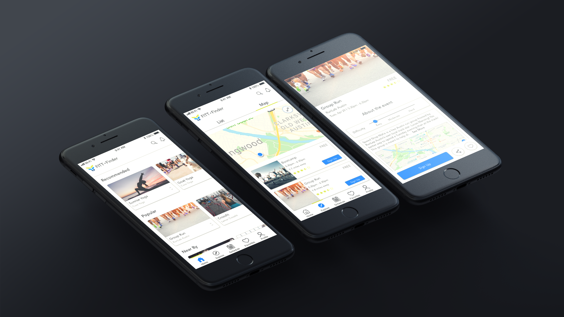
FITT Finder is a fitness and wellness app that provides access for everyone to local health classes and events that cost nothing.
Research
We were presented with an existing application that seemed to contain everything users needed and wanted, had a decent navigation system and was visually inclined. But as we dived further into the IA and shifted our eyes from new user mode to designer mode, we saw just how challenging the app truly was. The navigation was super confusing, the information architecture didn't make much sense, and the visuals needed to be addressed. This was why users would download the app but be reluctant to continue to use it. Thankfully my colleagues and I were the fresh set of eyes and skill set FITT Finder desperately needed.
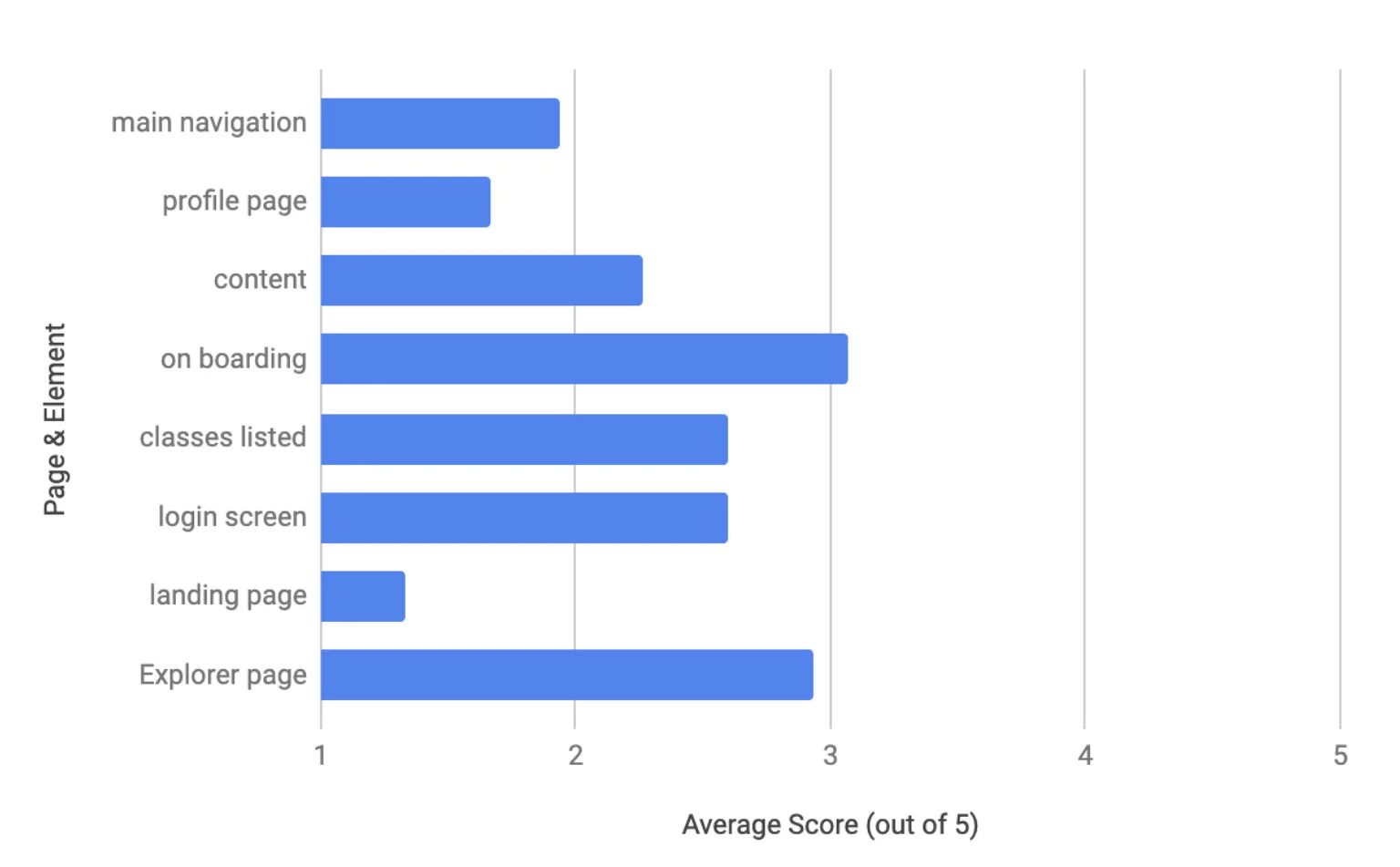
After meeting with the stakeholder to get a better understanding of the company, their goals, their weaknesses, and any other bits of info we could squeeze out of him. With no project guidelines given, we knew we first needed to get the existing app in front of fitness app users to help us point us in a direction. We knew what the issues were but we needed to justify our assumptions. So we set up usability testing with 9 users ranging from 22-45 in age and from beginner to advance with their fitness activities. We asked the users the same 3 tasks that led them down every avenue of the app.
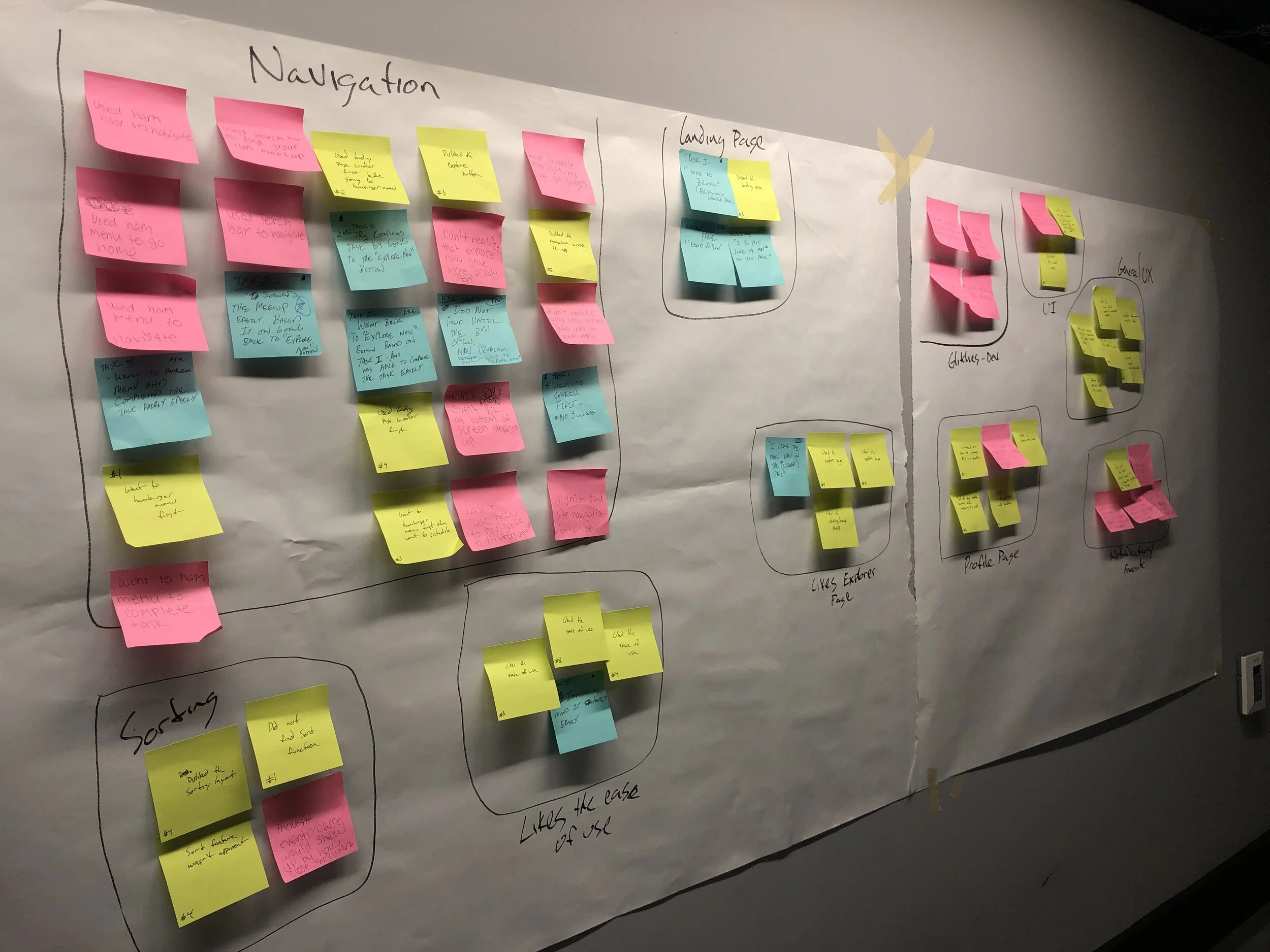
Along with this test, we performed a heuristic evaluation which led us to synthesize all of the data through an affinity map which reassured our assumptions; the areas we needed to focus on were the navigation, the profile, general interface issues, and information architecture.
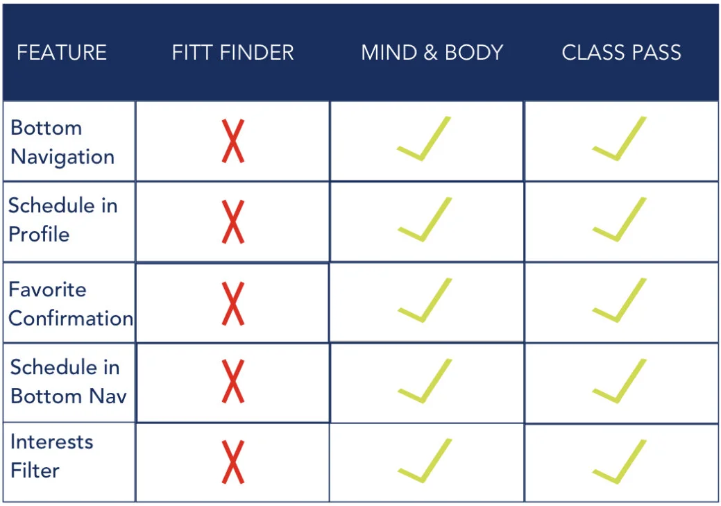
We also did a competitive analysis but we ran into an issue; our competition dominated our product in every way possible. So we knew that we needed to look deeper into why users were using our competition and what they liked/disliked about their services. So to help us gather more information regarding our competition, I sent out a Google Survey through various local social media platforms asking anyone with experience with Class Pass, MindBody, and Meetup to complete a quick 20 question survey. Out of the 12 responses we received, the following data helped direct our redesign:
The features the users enjoyed most about the apps were:
Ease of use
Schedule
Ability to favorite studios, classes, and/or events
Customization
Getting this kind of data was huge for us! We were now able to hone in on design ideas and put together our design plan.
At this point in our research phase, we met with the stakeholder to discuss our findings and plan. He was very surprised by our research and specifically the issues around the overall navigation of the app but was pleased with our design plan and gave us the green light to move forward as scheduled.
Ideation
So with all of our data in hand, it was time for us to ideate through a design sprint. We spent a few hours going through various paths and features, no idea was too small or too daunting. We tried different navigations, different page layouts, and features that would set us above the competition while keeping our current and new users coming back to the app. Some of these ideas we knew we wanted to test out were:
Ability to view your upcoming and past class schedules
Ability to set class radius based on your current location
Ability to set the level of difficulty with your search
Ability to filter down the search by activities
Ability to set the day and time of the search
Directly linking to class facility on class listing
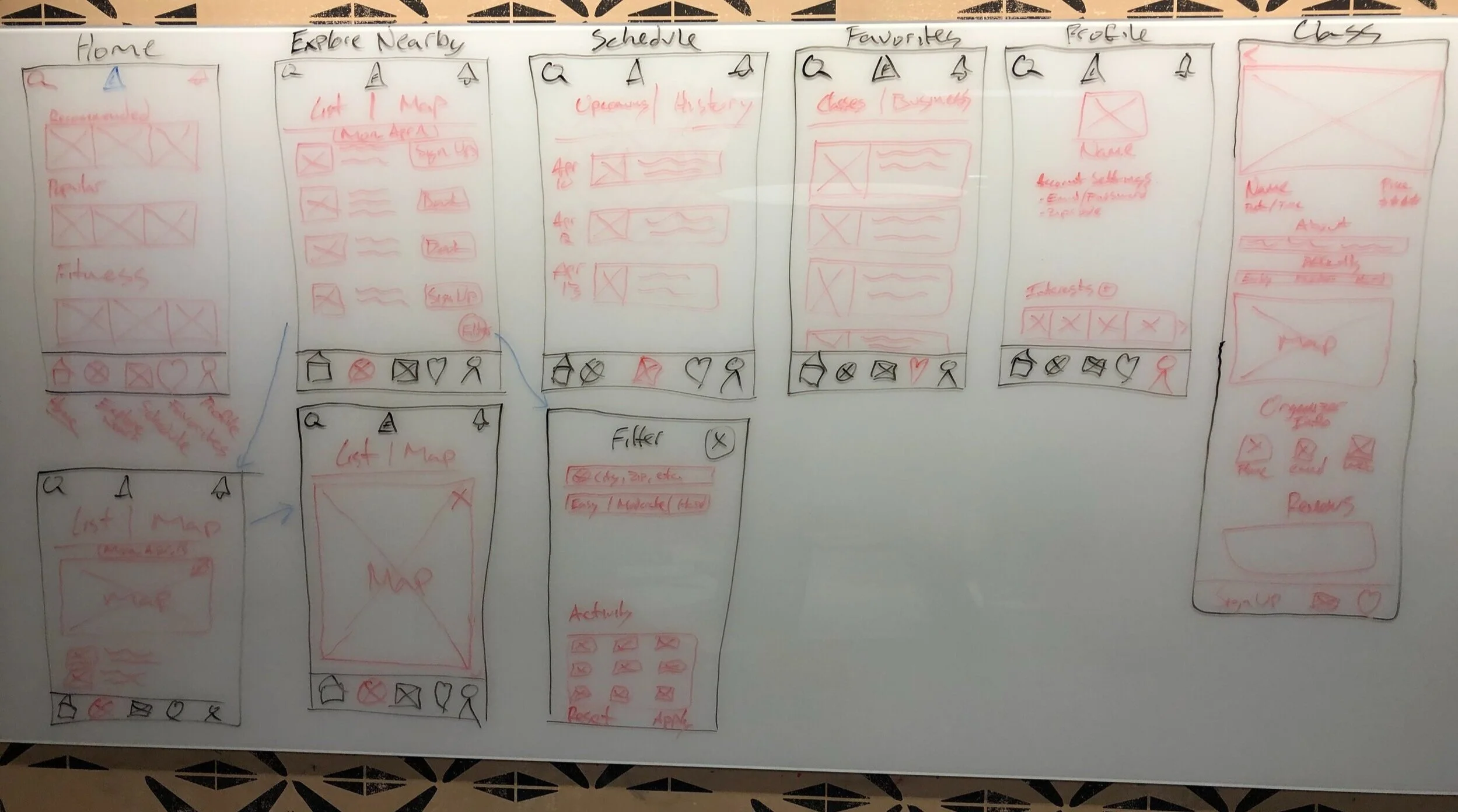
So with these new ideas, we created some low-fidelity mockups for our next round of testing. We took a field trip to a local coffee shop that was next to a gym. As customers entered and were waiting for their coffee, we were able to gain some valuable insights on our mockup. Out of the 23 people we spoke with, 18 of them loved the ideas of being able to customize the search. When asked if we were missing anything valuable for the user, a majority of the feedback we received was to incorporate a confirmation prompt when the user did enroll into a class. With all the new feedback in hand, we went back to the drawing board to incorporate a confirmation prompt that would also allow the user to add their newly scheduled into their devices calendar.
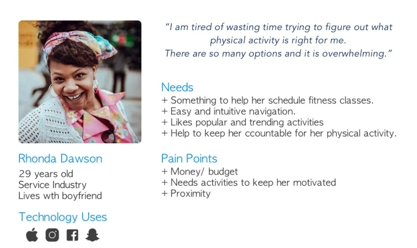
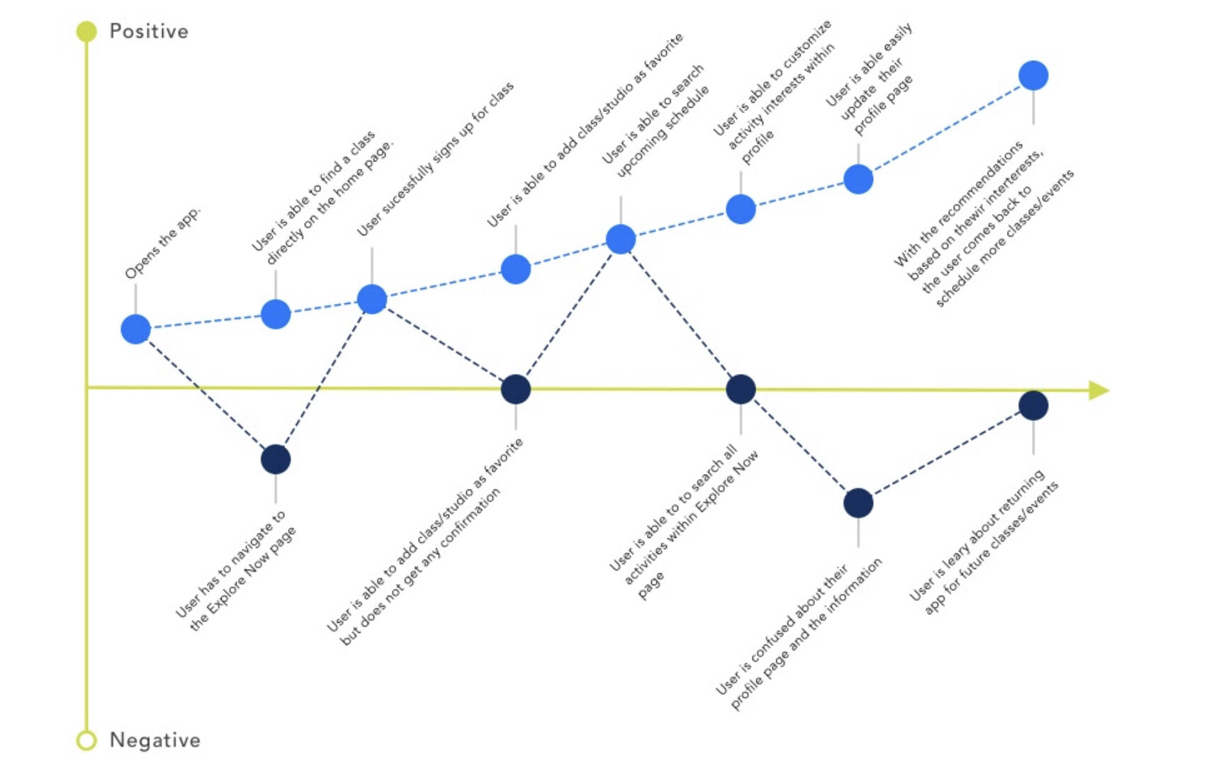
Once we got our design dialed down, we were able to complete our persona and customer journey. This was particularly fun for me because with all the new changes we were incorporating, you really got a feel for how improved this was going to be. It felt up to date with today’s standards.
Development
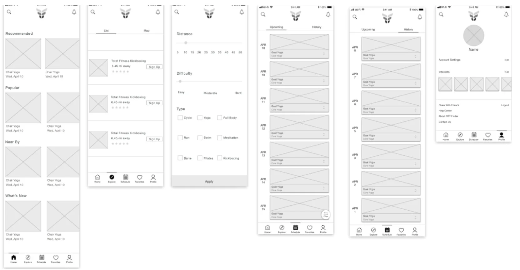
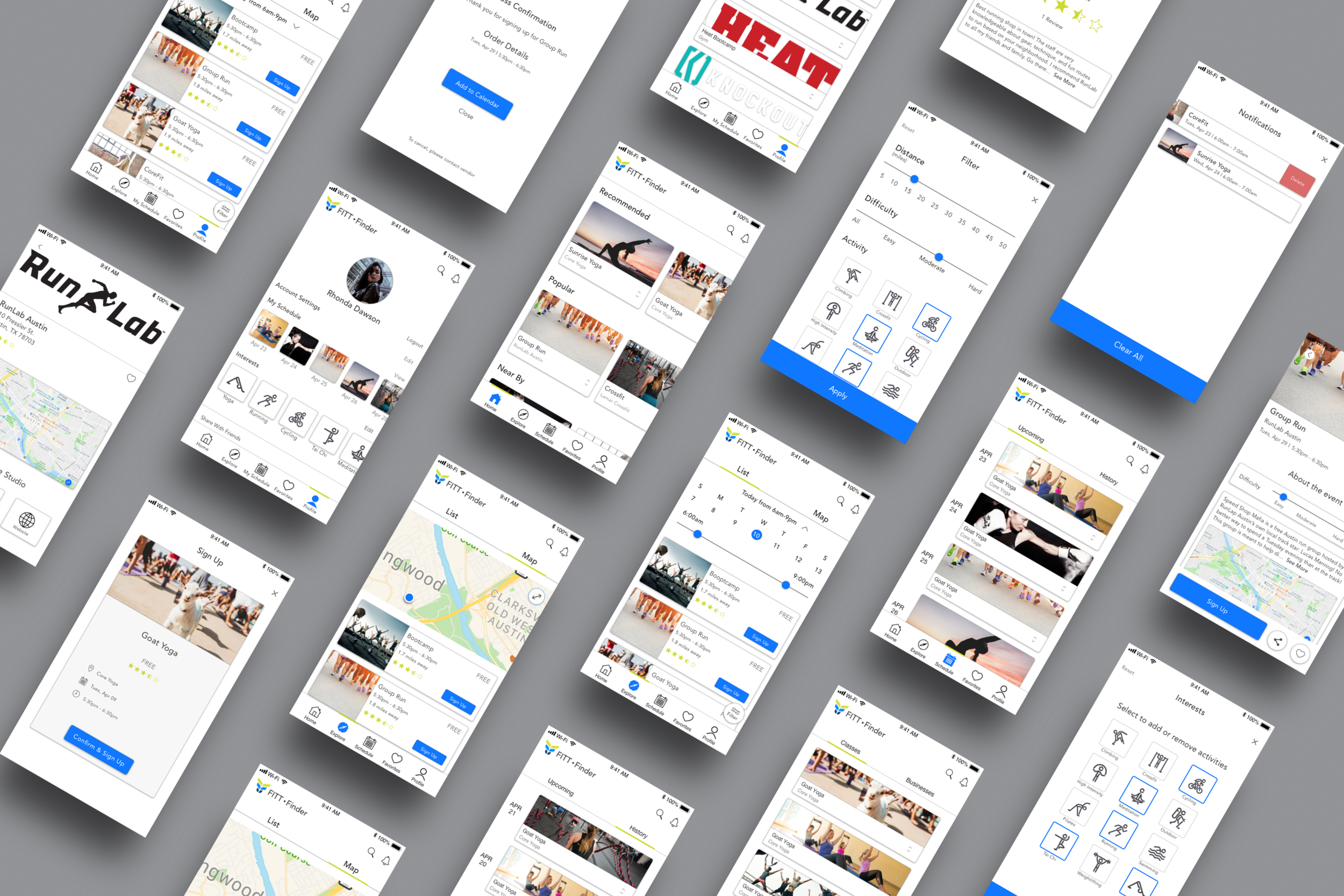
With the research and ideation stages complete, it was time to turn our sketches into mid-fidelity wireframes. The biggest items we needed to finalize here was the placement of the new features along with the new activity icons we were incorporating. We contacted a fellow graphic designer to help us firm up some icons needed to which she provided us roughly 20 stick figurine each depicting a different physical activity. With the new features and icons added to the design, we went back to the coffee shop for another round of testing. This time we were able to test the mockup with over 30 customers, including 7 customers we’d tested with just a couple days prior. The feedback we received this trip was better than we could have imagined. Everyone thought the flow worked very well and it felt like a modern app they would use daily. They particularly enjoyed the new filter feature as well as being able to view your class schedule in a clean and orderly way.
Usability
Testing
During our final round of testing, our user group provided us some minor design recommendations that would enhance the overall usability. Some of these items were:
Compartmentalize the Notification and Search icons
Make the schedule selector more accessible when looking for classes
Include the users upcoming schedule on the profile page
Along with these recommendations, we wanted to make sure that the redesign met current design standards as well as accessibility requirements.
Hi-Fi’s
With all the amazing feedback we had received, we were eager to dive right into finalizing the design and creating the prototype for the client. Thankfully the client had provided us all their branding materials ahead of time so our main priority was to make sure the design was clean and pixel perfect while maintaining design standards and accessibility. With our final design nearing completion, we wanted to do one last round of testing with past participants, so back to the coffee shop we went. We met with 5 previous testers who all loved the mockup we had provided with some minor tweaks that needed attention (spacing and size of class confirmation details). So now it was time to put the redesign to bed and prepare for our final presentation to the client.
Reflection
Being a physically active person myself, this was a fun and very rewarding project for me! I recognize the need and desire to help people become more active and ultimately more healthy was right in my wheelhouse. We successfully were able to take an outdated app, redesign it based around users needs and feedback while bringing it up to current design standards. Our client was extremely thrilled and in awe with the work we had done in such a short amount of time. I couldn’t be happier and impressed with my team and the collaboration we achieved.
